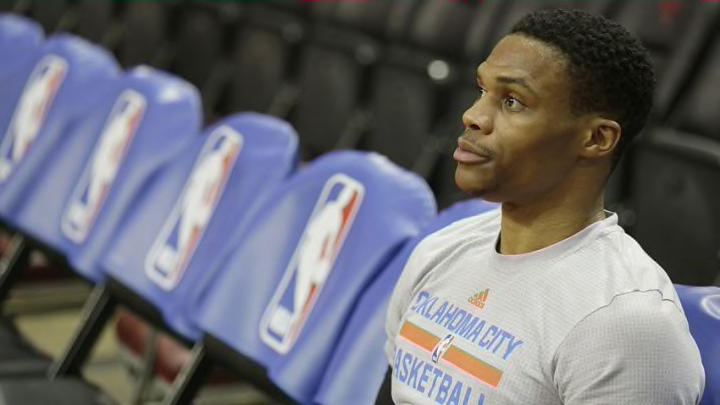
Dear Nike, Please fix the Oklahoma City Thunder’s jerseys
By Tony Heim

For eight years us Thunder fans have been tormented by some of the ugliest uniforms in the NBA. Nike has the power to change that.
Dear Nike,
Before I lay out my argument on why you should change the Thunder’s jerseys, I should tell you something. I’m never going to buy one of them. Okay maybe not never. But definitely not now. I’m a broke college kid and I can’t imagine how much your jerseys are going to be.
But I need you to do this for me. I just can’t look at these things 82+ games a year anymore. And I’m not in the minority on this one.
Not surprising news, but @UniWatch says several NBA teams are getting jersey redesigns next year. If one isn't OKC, Nike is doing it wrong. pic.twitter.com/uC4i7aOaGD
— Yaya Dubin (@JADubin5) January 17, 2017
There’s more to it than just the actual design. But that’s what I want to talk about first. We’ll start with the home jersey.
In the NBA the official home jersey has to have a basic white color, which sucks. That’s why alternatives have become the big trend. The Thunder’s alternate also is pretty awful, but we’re not there yet.
First off, the “Thunder” is just so lame. If the mascot is going to literally be a sonic boom there is no excuse for the basic Microsoft Word font. That thing needs to be wavy or twisty or bubbly. IDK. Sonic bomb is cool and that font is not.
Than we look at the trimming. Who thought orange on top of blue was a good idea? No no no no no. If we’re going to run with Thunder blue has to dominate. Naturally, Thunder comes when it is either raining and grey or at night. There is nothing sunny (i.e. orange) about Thunder.
Follow Thunderous Intentions on Facebook and Twitter
Side note: The orange shouldn’t even be a part of the color scheme. Let’s make it a nice golden yellow instead.
The only thing I like about the white jersey is the side. Why? Because the line is predominantly blue. Now to the away jerseys.
You know how I said I like the blue? Yeah not like this. The light blue is a perfect secondary logo color. When it dominates like it does in the away jersey it hurts my eyes; a jersey should never look like a denim vest from afar.
If we’re switching up the font I’d love to see the “Oklahoma” and “City” on opposite sides of the number. Maybe twist it around the number? I’m sure you all will figure that out.
And than we get to the alternate. Another big whiff on the primary color. Bright orange? Are we trying to dress a fourth grade YMCA team? This is the big leagues and you have the ever important task of dressing Russell Westbrook every night. Don’t disrespect this man anymore than he already has been.
We’ve been through the visual aspects of why the Thunder need a jersey change. But the emotional reasons are truly why you should give us a “fairly bold redesign.”
More from Thunderous Intentions
- Stealing one player from every Southwest Division team for the OKC Thunder
- Should the OKC Thunder chase after a disgruntled hometown hero?
- 3 OKC Thunder players who can step up in Aleksej Pokusevski’s absence
- Aleksej Pokusevski sidelined approximately 6 weeks with ankle injury
- Damian Lillard does not fit with the OKC Thunder
Think about what we have seen in those designs. We watched two 23-year olds and a 22-year old lead our team to the NBA Finals. Each season after something unfortunate happened, whether it be injuries or playoff breakdowns or a trade.
This season feels like a new era. We have six new rotation players, an entire new identity…and the same dang jerseys. Every time I watch them I’m reminded of What Was and What Could Have Been.
It haunts me every day. It will probably always haunt me.
Something as simple as a new jersey scheme would help ease the pain. It really would. If we’re riding with the “Thunder” I know you can come up with a creative concept.
Thanks for taking the time to read my letter,
A way-too-obsessed Thunder fan